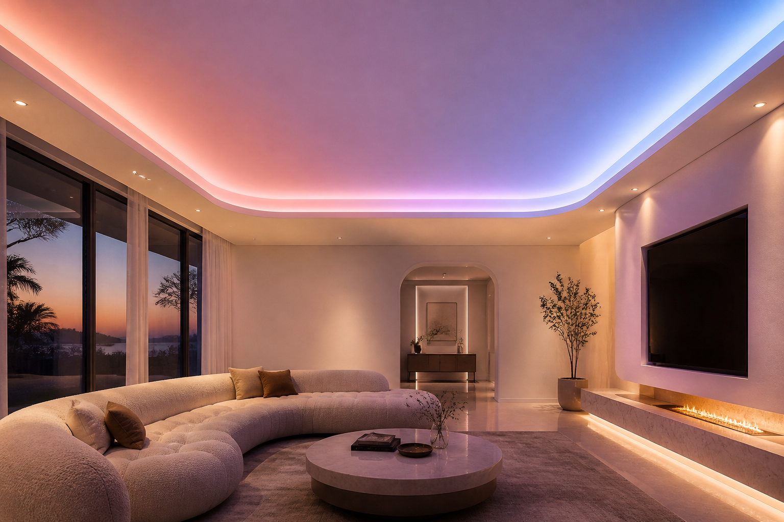
Visual comfort is a critical factor in any environment where people spend extended periods looking at surfaces, reading, or working. Light colors play a fundamental role in creating spaces that are easier on the eyes and more pleasant to inhabit. The relationship between color choice and visual comfort is not merely aesthetic but deeply rooted in how the human eye and brain process light, contrast, and color information. Understanding why light colors improve visual comfort can help you design better workspaces, homes, and retail environments that support both productivity and well-being.
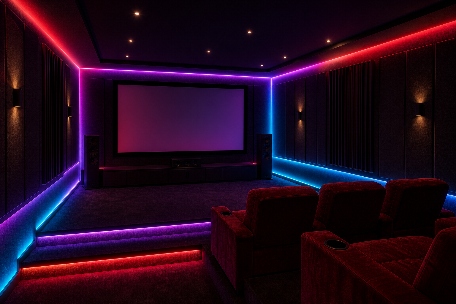
The science of visual comfort reveals that pastel shades and neutral tones are inherently gentler on the eyes than bright, saturated, or dark colors. When you surround yourself with these softer color palettes, your eyes experience less glare, reduced contrast strain, and a more balanced distribution of light. This translates to fewer headaches, less fatigue, and improved concentration over long hours. Soft hues allow your visual system to remain in a relaxed state, which is particularly important in modern work environments where screen time and artificial lighting are unavoidable.
How Light Colors Reduce Eye Strain and Fatigue
Understanding Visual Contrast and Brightness Perception
Light colors reflect more light wavelengths compared to darker shades, which means they create a more uniform brightness environment. When surfaces surrounding you are neutral tones or pastel shades, your pupils do not need to constantly adjust to extreme brightness variations. This stability in light levels significantly reduces pupil dilation and constriction cycles, which are major contributors to eye fatigue. The light colors in your environment work synergistically with ambient lighting to create a balanced visual field that is less taxing on your ocular muscles and lens accommodation system.
The Role of Soft Hues in Reducing Glare
Glare occurs when high-contrast bright areas force your eyes to work harder to process visual information. Pastel shades and soft hues naturally diffuse and scatter light more evenly across surfaces, minimizing specular glare that causes discomfort and visual distraction. This property of light colors is particularly valuable in offices, hospitals, and educational settings where people need sustained visual focus. Neutral tones create a visual foundation that allows task lighting and computer screens to stand out appropriately without overwhelming the eye, thus supporting better visual hygiene overall.
Creating Optimal Environments with Neutral Tones
Workplace Design and Productivity Implications
In contemporary workplaces, the choice of wall colors, ceiling finishes, and furniture upholstery directly impacts employee well-being and performance. Neutral tones and soft hues have been shown in multiple studies to support concentration, reduce stress responses, and improve overall job satisfaction. When workers are surrounded by pastel shades rather than aggressive or dark colors, they report fewer symptoms of visual discomfort, headaches, and mental fatigue. The psychological association of light colors with openness and calm further reinforces the physiological benefits, creating a synergistic effect that enhances both comfort and productivity in the workspace.
Home and Residential Spaces
Residential environments benefit equally from the visual comfort advantages of light colors. Bedrooms, home offices, and living areas painted in neutral tones or soft hues promote relaxation and better sleep quality. The consistent luminosity provided by light colors throughout a room helps regulate circadian rhythms and reduces the visual stimulation that can interfere with rest. Soft hues also create flexible backdrops for personal décor and lighting additions, allowing residents to layer their environment without overwhelming visual inputs. This is especially important for individuals who spend significant time working from home, where visual comfort directly influences work quality and mental health.
The Science Behind Color Psychology and Visual Processing
Neurological Response to Light Colors and Pastel Shades
The human brain processes color information through complex neural pathways that connect visual perception to emotional and physiological responses. Light colors and neutral tones activate the visual cortex in a way that promotes relaxation rather than alertness or stress. Pastel shades, which are light colors with reduced saturation, trigger minimal neural agitation because they require less cognitive processing effort. This reduced mental load allows the brain to allocate resources more efficiently to primary tasks, whether reading, working, or resting. The relationship between color choice and nervous system activation explains why environments dominated by soft hues feel inherently calmer and more visually comfortable.
Long-Term Health Benefits of Consistent Visual Comfort
Prolonged exposure to visually uncomfortable environments can lead to chronic conditions such as digital eye strain, migraines, and even exacerbation of existing eye conditions. By deliberately incorporating light colors, neutral tones, and soft hues into your surroundings, you invest in long-term ocular health and neurological well-being. Regular workers in well-designed environments with appropriate color schemes report lower incidence of vision-related problems and better sustained performance over decades. The cumulative effect of visual comfort gained through thoughtful use of light colors compounds over time, making initial design investments highly cost-effective from both health and productivity perspectives.
FAQ
Why are light colors better than dark colors for visual comfort?
Light colors reflect more light and create uniform brightness levels, reducing the strain on your pupils and eye muscles. Dark colors absorb light and create high-contrast environments that force your eyes to work harder, leading to fatigue and discomfort. Neutral tones and soft hues provide the optimal balance for sustained visual comfort throughout the day.
Which pastel shades are most effective for reducing eye strain?
Soft hues in the pale blue, soft green, warm beige, and light gray ranges are particularly effective at reducing eye strain. These neutral tones mimic natural daylight qualities and minimize glare while maintaining visual interest. The specific choice depends on your environment and personal preference, but cool pastel shades tend to feel more refreshing while warm neutral tones create a sense of comfort and coziness.
Can light colors improve concentration and productivity?
Yes, research demonstrates that environments painted in light colors and neutral tones support better concentration and higher productivity levels. When visual comfort improves, mental fatigue decreases, and cognitive resources previously devoted to managing eye strain become available for actual work. Soft hues also create psychologically calming environments that reduce stress-related distractions and support sustained focus on complex tasks.
 EN